Top 5 UX/UI Trends for eCommerce in 2021, Graphic design and website development take a vast set of visual elements. In the era of graphic design freedom, designers can apply them however they like. But, you still need to stick to some trends. After all, any efforts aim to get the viewer’s attention. That is to provide them with aesthetic pleasure, fast loading, and easy navigation.
UX UX Trends For eCommerce
Table of Contents
Also, the scope of shopping platforms is expanding, and business owners need to master not only mobile versions but also TVs, voice assistants, and even refrigerators. Therefore, your graphic design has to be equally good on any screen. In this article, we’ll look at the top UX/UI trends for eCommerce in 2021.
Top 5 UX/UI Trends in eCommerce to Observe in 2021
Here is list of Top 5 UX/UI Trends for eCommerce :-
1. Download Speed and Cross-Platform Solutions
Heavy, unoptimized images are one of the reasons why the site loads slowly. And pictures are the basis of online sales. If viewers have to wait for images to load for eternity, they won’t see your product and close the page. In addition, it will lead to high bounce rates, poor SEO rankings, and losses.
Therefore, store owners can try Magento image optimization or any other one depending on your eCommerce platform. Some of the universal image optimization tips include:
- using lazy loading;
- caching;
- image compression;
- modern image formats like WebP;
- application shells;
- among others.
Website loading speed remains one of the main ux/ui trends in eCommerce in 2021. Also, thanks to the emergence of new platforms for interacting with the store, people utilize not only the desktop version to view products and place an order. Therefore, it is necessary to ensure that the loading speed from the mobile version is not lower but even higher than the desktop one.
Increasing loading speed is a matter of quality design and technology choice. As a result, software technologies, which were initially designed to minimize speed (PHP, HTTP/3, Lazy loading or image caching, WebP), are becoming more relevant.
2. User Experience Affecting Rankings
Previously, there was no public confirmation that user experience affects the ranking of web resources. However, the situation changed, and the Google Page Experience algorithm is to be released this summer.
How convenient it is for a customer to interact with the site is among the critical behavioral factors. This algorithm contains several requirements for Internet platforms:
- Convenience, readability, and indexing of the mobile version.
- Client’s safety, no hidden content, and malware.
- HTTPS availability and browsing security via an SSL certificate.
- Ease of content perception: no intrusive and interfering blocks.
- Core Web Vitals: Cumulative Layout Shift (CLS), Largest Contentful Paint (LCP), First Input Delay (FID). I tried to check if the Coca-Cola website met these metrics. Unfortunately, I found that even such top brands have a lot to improve. In the screenshot below, you can see the results of my analysis. The company meets only one metric, and the other three need fixing.
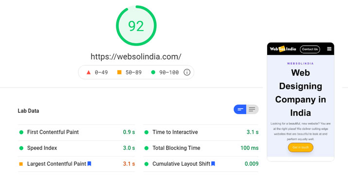
The Google Page Experience update intends to evaluate sites based on how people interact with them and to improve user experience. As a result, some of the features that affect the interaction of buyers with the page and influence on-site behavioral factors become confirmed ranking signals. Therefore, SEOs and UX designers now have to invest a lot of hours into this segment.
3. Simplifying the Interface
UX/UI trends in eCommerce, owners ditch overloaded pages with lavish elements and text. Minimalism solves business problems better and brings in more profit than expensive, intrusive design.
The interface needs to ensure the site’s readability for the customer and lead to the fulfillment of key actions. Therefore, don’t distract the attention of the buyer. Instead, keep them focused on the essentials with a simple and straightforward design.
Interface cleanliness is especially relevant in fashion. The content is the main thing here, and the interface can influence decision-making and emphasize itself. For example, the Chloé main page presents a clean and laconic design. Nothing prevents you from focusing on the product. Pages convey all the necessary information.
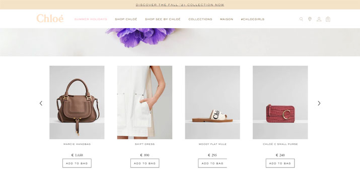
But the main thing is not to overdo it with minimalism and consider the niche in which the business operates. To illustrate my point, in electronics, you need to describe a complex, technological product with specific properties.
In addition, you have to emphasize competitive advantages to show full multimedia capabilities. Therefore, minimalism isn’t justified for household appliances, mobile phones, and cars. Like on the screenshot below, you can see a product page of the Newegg online store.
Conclusion: Simplify the interface as long as it doesn’t affect its information content.
4. Constant Growth of Mobile Share
Techjury cites statistics that 79% of smartphone users have preferred mobile devices to shop online. Furthermore, the percentage of mobile traffic is growing every year. The adaptive version of the site should be convenient enough so that a person can make a purchase with one hand and on the go.
However, a client needs to get all the necessary information from the smartphone when making deliberate purchases. Namely, see a big photo, full description, and characteristics, watch a video review, product ratings, use filters, pay for the purchase, and arrange delivery.
Customers often choose and look via mobile but buy on the desktop. Therefore, the desktop and mobile versions of the site should be equal in terms of convenience, informational content, and functionality.
Below you can see screenshots of the Iceberg online store and the Housing.com property search portal. For users’ convenience, the store owners have made two buttons at the bottom of the screen. This step makes adding a product to the cart or wishlist easier. However, Housing.com is an example of a PWA. It has gone a step further and put the menu tab with all the site navigation buttons at the bottom of the screen.
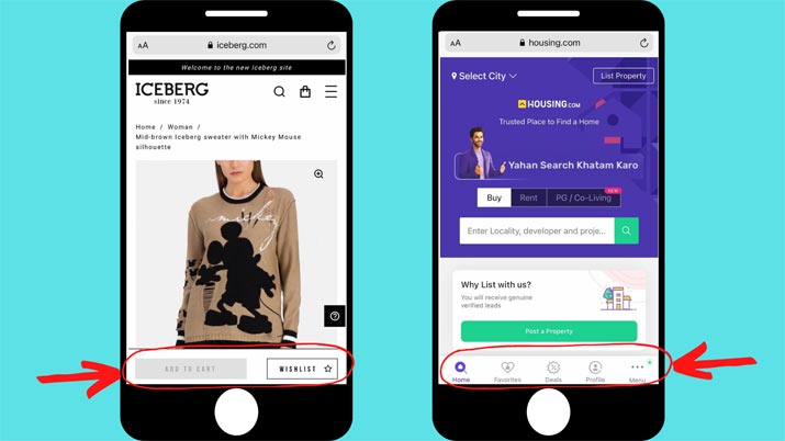
Keep track of the distribution of traffic by devices on your store. Remember, if mobile conversion and usage are significantly lower than desktop, this is a reason to test usability. Perhaps the interface isn’t convenient for smartphone viewers.
If mobile traffic prevails, then it makes sense to follow the mobile-first approach when designing the interface. In the classical approach, the convenience of using the desktop version is thought through first, and then it is adapted for mobile. And when using the mobile-first approach, the mobile version of the interface is first considered and then scaled for high resolutions.
5. Animation to Grow Sales
Companies are spending more and more time developing engaging and unique animations. The reason is that animated videos can hook a viewer better than a regular picture.
Primarily, computer graphics finds application in digital advertising or social media. It is one of the most potent ways to revitalize a brand and create a unique image.
However, it now goes beyond simple GIFs. Companies develop animations as a story, immersing people in the site and content. There are several ways how it can help marketers increase sales:
- Storytelling and learning. With the help of an animation, you can show the audience how the business has developed, the product origin, and emphasize your values. You can also create tutorials using exciting characters and talk about something in an informal atmosphere.
- Connect the brand with the audience on various marketing channels. For example, if you make the audience fall in love with your characters and engage with your story, people will more quickly become absorbed in the company on an emotional level. Another plus of animated videos is that they help to achieve the optimal balance of fun and professionalism. And they look good both on television, on mobile, and on social networks.
- Increase traffic and SEO. You can create instructional videos, upload them to YouTube and integrate them into your website. It will be good for your SEO as potential clients will stay on your page longer. You can also use keywords to make people find your video faster and go to your site.
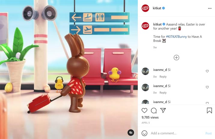
Many food brands employ animated videos, and Kit Kat is one of them. You can see on the screenshot below an example of their video on Instagram with a cute bunny dedicated to Easter.
Summary
Conclusion of top 5 UX/UI trends for eCommerce in 2021, the importance of user experience only grows every year. It manifests itself in how the algorithms rank sites and how long customers stay on your online store. The design should also emphasize that you care about the convenience of your visitors.
Therefore, think about transparency and simplicity when creating your brand and product. Pay more attention to speed and mobile usability. Don’t overload the site and place the accents correctly. And then, hopefully, you can see an increase in brand loyalty and conversions.
About the Author

Kate Parish is the Chief Marketing Officer at Onilab with over 8 years of experience in Digital Marketing in the sphere of eCommerce web development. Always aspires to broaden her competency in line with cutting-edge global trends. Her primary areas of professional interest include SEO, branding, PPC, SMM, Magento PWA development, and online retail in general.



2 Replies to “Top 5 UX/UI Trends for eCommerce in 2021”